Challenge 3: Usability Evaluation and Site Redesign
Jump into the shoes of a world traveler and choose to visit one of the world’s seven wonders of the new millennium — Machu Picchu, Peru!

Mantra
“I’m not the user of the product I’m creating and evaluating.”
I had to keep this mantra on repeat inside my head because visiting Peru is on my bucket list for a long time now, so it was great to learn more about it for this assignment.
Scenario
You and your partner decide to go to a special place next summer.
You realize you have both saved enough for the tickets and are planning to save as much as possible for the next 6 months to make this trip.
You want to be efficient and have everything you need organized to enjoy at 100% while there. Even if you’re young, you want to have special moments to celebrate being together.

User type
Young couple — 20–40 y/o (2)
Meet Daria and Matt.
They’re a young couple in the mid-’30s, and one of the things they love the most is traveling.
They feel enriched by all the culture and people they meet along the way.
They wish for it.
So they save all the money they can to every year immerse themselves again in another reality.
Daria is a photographer, and Matt is a web developer.
Research
At this stage, I investigated the specifics of the destination I chose.

Nearest airport/most convenient airport to the destination:
Alejandro Velasco Astete International Airport in Cusco.
Cusco is the nearest major city, current regional capital, and former capital of the Inca Empire.
Currency and exchange from your own currency:
Peruvian Sol as from July 1, 1991.
1 Peruvian Sol is equivalent to 0,22 euro (05/18, 13:52 UTC) —
Currency data provided by Morningstar.
Everyday transactions also use US dollars and even euros. Credit cards are accepted in hotels and restaurants, but it is advisable to have cash on hand, as most places do not work with cards.
Medical needs:
First of all, considering that Cusco is 3 399m above sea level (it is regarded as one of the highest cities in the world), avoid making unnecessary efforts or eating heavy meals on the first day as this can contribute significantly to getting altitude sickness.
Altitude sickness occurs when you cannot get enough oxygen from the air at high altitudes. This causes symptoms such as a headache, loss of appetite, and trouble sleeping. — HealthLink BC
👉 Don’t drink tap water (no ice either); only consume boiled water or bottled water well sealed;
👉 Avoid milk or milk products unless they’ve been pre-pasteurized;
👉 Disinfect and/or wash your hands often;
👉 Sunblock is a must;
👉 Staying hydrated and eat small snacks to remain energized for your long-awaited visit;
👉 BYOIR — Bring Your Own Insect Repellent;
Machu Picchu is located between the jungle of the Amazon and the Andes mountain range. It has a very peculiar climate characterized by the presence of mosquitoes that sting and irritate the skin, especially during the dry season.
👉 Passport legitimately issued by a country with a minimum validity of six months from the date of entry into the country;
👉 Most countries in the Americas and Western Europe do not need a tourist visa to enter Peru. The maximum length of stay that the authorities grant tourists is 183 days and cannot be extended. If you want to stay longer for other reasons, such as business, studying, or working, you need to apply for a visa at a Peruvian consulate in your own country.

Vaccines recommended by the WHO (World Health Organization):
- Typhoid;
- Hepatitis A;
- Measles, mumps, rubella (MMR);
- Diphtheria, whooping cough, tetanus (DPT).
If you decide to visit the Peruvian Amazon, according to the CDC (Centers for Disease Control and Prevention):
- Yellow Fever;
- Malaria;
- Rabies (for specific activities only);
- Dengue (there’s no vaccine for Dengue, so prevention is based on avoiding mosquito bites).
Wardrobe recommendations:
👉 Comfortable shoes and clothes;
👉 Hat;
👉 Warmer clothing — 20ºC (68ºF) is the average annual temperature in the region, but it falls almost by half at night.
Days to visit attraction:
This is a little subjective, but after a bit of investigation, I found that it takes an average of 3/4 hours to visit Machu Picchu’s Park.
Still, you need at least two visits to fully appreciate it and experience the many things to do at the site.
Benchmarking
KAYAK, Skyscanner, and Tripadvisor were the apps selected to conduct Usability Heuristics Evaluation to identify the one that performs better for my chosen user type/scenario.
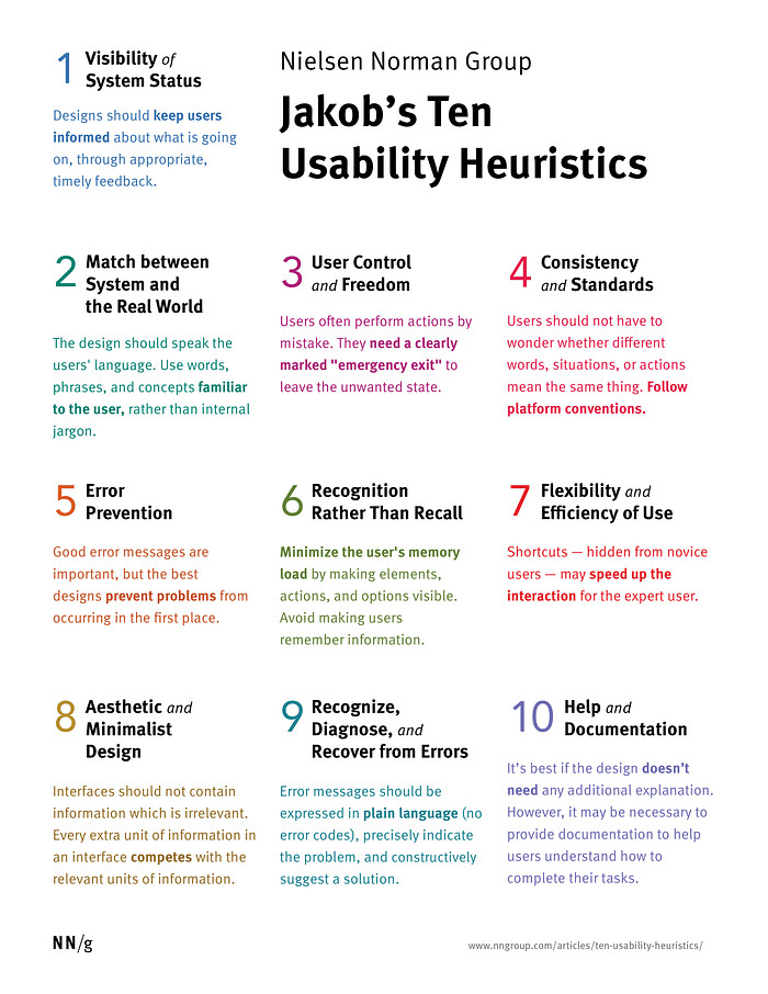
Heuristics? 🤔
In UX Design, a heuristic evaluation reviews a site’s interface against a predetermined set of usability guidelines like the most well-known — Jakob Nielsen’s 10 Usability Heuristics for User Interface Design.
Unlike user-testing, where users evaluate the site (or prototype), the site is assessed by usability experts in a heuristic evaluation.
After reviewing all three apps following the usability heuristics mentioned above, I found discrepancies between them, but overall, I felt they were in sync with these rules of thumb.
Considering the goals of my user type, Tripadvisor was the app that performed better for Daria and Matt.
However, all of a sudden, as I was preparing to perform my interviews, the flights’ button “disappeared” from the app’s interface. My interviewees wouldn’t be able to complete the tasks I had prepared before.

Because it has a great range of services like booking flights, hotels or vacation houses, activities, and restaurants, they could easily do all the planning in one place while reading what other travelers have to say and their ratings but (!) with this “catastrophic” event I switched to Skyscanner.

“We’re the travel company who puts you first”. — Skyscanner
Testing
In this phase, I targeted 3 users of my selected user type and performed the 5-second test.
Five second tests are a method of user research that help you measure what information users take away and what impression they get within the first five seconds of viewing a design. — fivesecondtest.com

My interviewees’ first impression about the Skyscanner’s app was that they didn’t know it was the Skyscanner’s app.
Meaning, there’s no logo on the homepage, except for the little one located at the left down corner on the search.
It was hard to recognize for someone who’s not familiar with this brand, but other than that, they quickly realized it was an app focused on traveling because the airplane was the first button they saw, followed by the hotel’s one.
However, they didn’t seem to notice the rent-a-car button so much because they don’t usually rent cars on vacations.
One of them said that the info about COVID-19 was useful, although he wasn’t sure about the accuracy of the data shown.
When asked to search and book a flight to Cusco for a week in June, they all did it relatively quickly, claiming it was intuitive and easy to follow and thought of it as a reliable app when transferred to the actual site to purchase the tickets.
They also thought the loading time was appropriate and felt that the app kept them well informed about what was going on when loading results, except when the flight results were being loaded. There’s only a progress bar with no information displayed to the user.

When booking a hotel room for the required stay, they felt like the app should wait for them to complete inserting all the data and then click on a search button.
Right now, every choice you make on that screen originates loading results for that particular choice. It doesn’t wait, which consumes time on the user end, and it doesn’t have a search button because of this automatization.
“It’s your world. We’ll help you explore it.” — Skyscanner
After the interviews and test sessions, I summarized my findings and understood what I could improve.
Pain points
👉 The user didn’t know it was the Skyscanner’s app — no logo immediately visible on the homepage;
👉 They didn’t seem to notice the rent-a-car button;
👉 When the flight results are being loaded, there’s only a progress bar with no information displayed to the user;
👉 When booking a hotel room, the app should wait for the user to complete inserting all the data, decreasing the time consumed on the user end by the loading results;
👉 No search button on the hotel booking screen.
Solutions
Regarding the pain points shown above, I decided to be very straightforward and focus on adding “small things” that I found lacking to improve the user’s experience while navigating the app.

Small changes can make a big difference.
Final thoughts
Throughout this usability evaluation and site redesign process, I found that a lot is going on backstage of a product.
It made me more mindful when looking and interacting with an app/website identifying inconsistencies and possible solutions for those by learning about Jakob Nielsen’s 10 Usability Heuristics for User Interface Design.
So far, this challenge was the most difficult one of all for me, but as I struggled, I kept reminding myself that this is just the beginning of my journey in UX design.
I have so much to learn, and for that, I have to be open-minded and recognize that I don’t know everything, and that’s ok.
You see, this is what keeps me going. Otherwise, it would be a very dull life.
I’m here to learn and become better, step by step.
Everyday.
Develop a passion for learning. If you do, you will never cease to grow. — Anthony J. D’Angelo
Thank you so much for reading!
VL
